for pixel works, it's recommended to put them in the tags, because then we can zoom in and give better detail.
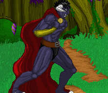
At first glance it feels like all the shades of the grass blend together in a rather meh result, distacting the from the main point of the image, the man(?). I think the colors feel a bit bright and... junk. etc.
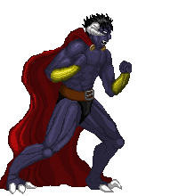
there's something weird about his right hand, too curvy in the wrong area? something along those lines.

 .
.