Envision, Create, Share

Welcome to HBGames, a leading amateur game development forum and Discord server. All are welcome, and amongst our ranks you will find experts in their field from all aspects of video game design and development.

Tileset Attempt?

I thought I'd try my hand at some tileset work, something I've never done before...
I'm a little hesitant to judge it myself, so I figured I'd ask for some C&C before I go too much further.
tilesetWIP.png

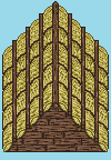
Excuse my atrocious texturing, that yellow muck is supposed to resemble hay.
Yeah, just a roof for now, but I might continue if you guys like it, this was just a boredom project if anything.


UPDATE:
Okay, I completely redid the hay, I have to admit it looked horrible.
I'm still a little iffy about it, but it looks better IMO. ;)
I copy and pasted the rows like I did before, but I don't think its as noticeable. Idk, you tell me...
tilesetWIP-1.png

I haven't touched the wood, apart from darkening the lightest shade a tiny bit.
I agree that it's too dark, and this wasn't really supposed to be a RTP add-on, so I'm not
too sure what I'll do with it right now.
 

Artia

Member

Mh looks quite good. I like the wood texture... maybe you have to diversify a little the roofs rows... you pasted the same row 8 times right?
 
I honestly can't see anything wrong in it.
I'm by no means an Artist though, I may not be the better person to judge.

But I like the style.
 
Some of the hay is a little too "pixelly", in that it looks more grainy/dotted than like hay strands. Hay's not easy to do; don't get down on yourself about it.

Otherwise, the wood has a REEEEAALLYY high contrast value, which the Inquisitor was able to get away with because all his art has high contrast, but if you're pairing this with RTP, you'll need to lower that by quite a bit. Nice start though!
 
Looking good, but i don't think the black wall fits very well.  It just looks like an empty space/opening as opposed to a wall.  The bricks look great!  Though it has some weird dark blotches.
 
Yeah the dark blotches are actually green and were intended on being moss/mold(?) to show that the house was old.
Didn't work out too well I guess?

When I was working on this I did a second version with the wall a light brown, and kinda liked that one better. I only posted the black one because I wanted to see if other people thought it looked off aswell. But yeah, I agree completely.

I added a bit more wood to make the wall look a little less empty, and I'm still debating on whether I should add a stone base around the bottom.
http://i14.photobucket.com/albums/a317/ ... tWIP-3.png[/img]
 
IMO, the bricks at the bottom are far too small. What template is this for? Bricks are often roughly the length of a person's forearm, and about 1 and a half to two times as thick.
 
It's come a long way from the first screencap!

I agree with Gratheo. Small patterns get "lost" by the eye easily, and tiling is easier to define. if you enlarge the bricks and add some darker values to the straw (to compliment the dark values found in the wood/bricks), you'll be looking good. I wouldn't complain if you added some texture to the beige wall, though :)
 

Thank you for viewing

HBGames is a leading amateur video game development forum and Discord server open to all ability levels. Feel free to have a nosey around!

Discord

Join our growing and active Discord server to discuss all aspects of game making in a relaxed environment. Join Us

Content

  • Our Games
  • Games in Development
  • Emoji by Twemoji.
    Top