Envision, Create, Share

Welcome to HBGames, a leading amateur game development forum and Discord server. All are welcome, and amongst our ranks you will find experts in their field from all aspects of video game design and development.
The Ark of Gladoria

The Ark Of Gladoria

3870_2344.png


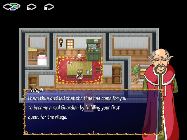
“Rei is a young boy who couldn’t care less about responsibilities and duty. And yet, he was taken as an orphan by the village elder and trained to become a Guardian sworn to protect those who welcomed him. As Rei returns from his first assignment however, all is not well in his home village of Real which only foreshadows worst things to come…”

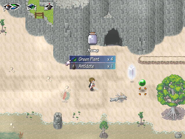
The Ark of Gladoria is an A-RPG game which is heavily inspired from Zelda: A Link to the Past. There are bombs to use, arrows to shoot, skills to be earned, weapons and armours to be purchased and levels to be increased.
Considered by many has a programming masterpiece.

Download


1.png

2.png

3.png

4.png

5.png

6.png

7.png
 

moog

Sponsor

uh here's a question

the hell is this game about

~You can give a little more information moog about what is missing and what you think of at least what is there
 
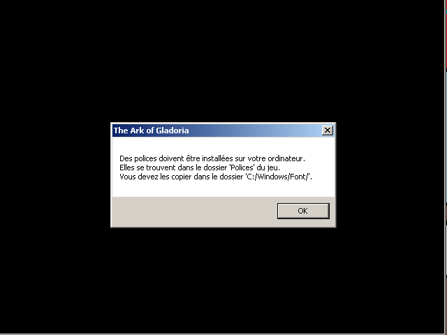
french1.png
(which I later fixed by installing the fonts)
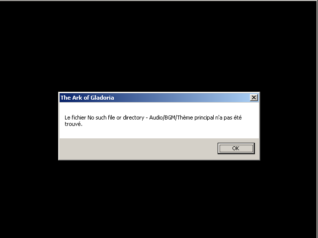
french2kinda.png
(which I assume happens because my computer turned all your glorious french into gobbldeygook.)
 
I think it is because a few audio files are missing, you you renamed something without changing it in the editor.

There isnt a lot of information here about the story and whatnot, if you give us more information itseasier for us to critique. Your artwork isnt very good. There is somepillowshading going on. I appreciate the custom artwork, but its not super quality art. Your maps are bland and without focus. there isnt anything going on in them and they are boring an mundane. Add more stuff to them and give them more structure. I do appreciate however the nice looking ABS system and the custom features that you have implemented and I think you worked more on the technical side than the artistic side. I would go back and try to clean up a few things. This also may be your first game, so you are learning the basics. Give us some more info on the story too.
 
The art could use a bit of touching up here and there but it's not really all that bad. There seems to be quite a bit of anime tossed in there (the giant spiky hair on the guy with the red cape is especially noticeable - it could be offputting to a few people.) If you're interested in improving some of the artwork or sprites then you can always check out some of our art forums and we'll try to help you out. :)

I'll agree that we could use a bit more information to entice people to play the game. What's it about? What's the game's main objective? The ABS looks really nifty, I wish I could try it out but I don't really have time :I
 
@Pokemaniac:
The first bug window says that you need to install the fonts.

As for the second bug window, I'll ask Zeus to have a look. I don't know why it's not working on your computer.

@bacon:
Just to clarify a few things:
I think it is because a few audio files are missing, you you renamed something without changing it in the editor.

There isnt a lot of information here about the story and whatnot, if you give us more information itseasier for us to critique. Your artwork isnt very good. There is somepillowshading going on. I appreciate the custom artwork, but its not super quality art. Your maps are bland and without focus. there isnt anything going on in them and they are boring an mundane. Add more stuff to them and give them more structure. I do appreciate however the nice looking ABS system and the custom features that you have implemented and I think you worked more on the technical side than the artistic side. I would go back and try to clean up a few things. This also may be your first game, so you are learning the basics.

I'm Creation, the creator of the game is Zeus. I translated his game ;).

As for the story, I will update my first post.

@dadevster:
I also think the art isn't that bad (and Zeus has actually improved his drawing tremendously since this demo was released).

If anything, try the demo for the technical side. I've yet to see something as advanced as this in RPG Maker XP games.
 
Hi guys, thanks for the comments.
The story is kinda cliche and that's not what makes the strength of this game so I don't want to dwell on it.
I agree that the art is not awesome as the maps (I already have start redoing all that btw) but I still think that this game deserve some attention and that you'll like it. ;)
I have removed all the glorious french chars from the filenames, a stable version (I hope) will be released soon.
 
Hey guys,

The game has been fixed. Dozens and dozens of translation mistakes have been fixed and the bugs mentioned in this thread has also been taken care of. The Font has also been changed as well as a few core mechanics to make the game more enjoyable.

I've updated the first message of this thread with the new link.
 
No one to try it ?
It's a demo with two hours of gameplay, a custom A-RPG battle system, a bit of humor, lot of sex scenes, and it sure works now !
Feedback are very welcome.
 
*Bump*

Sorry, but you guys seriously missing out big time :rock:

Honestly, I don't really get you guys, this game far surpasses a lot of things I've seen here (which are also good). :smile:
 
okay, okay i'll download! ;)

Didn't see this project before, but now i have high expectation of it. Let's see how this will turn out :)
 
Most people are probably not trying it out because you're not telling them anything. We know absolutely nothing about the story, the characters, the world in which this game takes place, or any of the game play features. It's just screenshots. Put up some info on the first post.

Gonna test it out because you seem like you really want some feedback. I'll let you know how it turns out

EDIT: Okay, here it goes.

To start with, you're mapping does in fact need some work. The maps are way too open and empty, at least the wilderness maps are any. The little village isn't too bad, still a bit empty, but no where near as bad as the forest. The house maps however are actually quite good. They're small and filled, they're very well done.

The music for the forest isn't great. It's just completely the wrong theme, it sounds like I'm at a festival, not in the middle of the woods. The theme for the city and the beach though are also pretty nice. Definitely look into changing that forest theme though.

There is a pretty big error with the messages. When they get too long, the words get cut off. Go through the demo and fix the messages because it happens pretty often.

The artwork could definitely use some work. But then again, I am slightly biased, as I can't stand anime art in games.

The menu is impressive in it's execution. The graphics could use some work also. Maybe a unique template. It does get kind of cluttered.

The story could definitely use work, along with the intro. Everything in the beginning just happens very quickly without an explanation. That and after playing I still don't really know a whole lot about what this game's story is. Work on the writing.

All that being said, the battle system is impressive. I hope it becomes more challenging as the game progresses, because right now it's pretty easy, but if the challenge and strategy comes more into play, it could be quite fun. Very reminiscent of Zelda, you pulled it off pretty well.

Also, the animations are very, very well done.
 
I played through the game and i agree with Spicy's post. The battle system is pretty impressive, just as the animations. But the exterior maps and story need some work. You find yourself in the story without really knowing what's going on.
 
As I said a lot of things are gonna change (including graphics).
The story is not clear on purpose, it's just the beginning, it will become more understandable further in the game. ;]
For the messages that are too long... Didn't you install the fonts ?
 
Since the presentation wasn't very appreciated, I updated it.
Hope it's better. :eek:
And I added an "Installer version", so there'll be no more fonts problems.
 
What an amazing start for a game!
Nearly everything was impressive, from the battle system to the menus. This is a game I really want to see finished.
 

Thank you for viewing

HBGames is a leading amateur video game development forum and Discord server open to all ability levels. Feel free to have a nosey around!

Discord

Join our growing and active Discord server to discuss all aspects of game making in a relaxed environment. Join Us

Content

  • Our Games
  • Games in Development
  • Emoji by Twemoji.
    Top