Perihelion
Sponsor
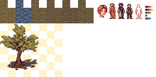
Playing around with a different style than you usually see in RPG Maker. As usual for me, these are tall sprites designed for 16x16 tiles. Working with low color counts is fun (each sprite has 4-5), and I'd like to make some graphics for these with a palette limited to 32 colors or something like that as an exercise.
Also made a couple tiles for them, as you can see. I hate spriting water (seriously, it is fucking impossible, and then you have to animate it), and this water tile in particular is weird-looking, so I'm probably going to redo it. In any case, I think these look kind of out of place next to the sprites; they're a bit too detailed and the color's off, but the color will probably change (and get darker) as I do more work on the palette, which will be sort of dusky and reddish. As for the portrait, it's a bit rough, but I mainly wanted to see if I could 1. do small portraits and 2. do small portraits with only a few colors (this is five, which is a bit more than I wanted, but oh well).
Anyway, critique!
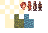
Edit: Tweaked the palette. Subject to further tweaking; the contrast on the water now looks weird, but I can't fix it this second because I have to go to class. It's going in the right direction now, anyway. Haven't decided if the "green" is too yellow or not.
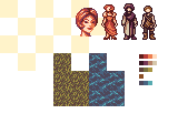
Also made a couple tiles for them, as you can see. I hate spriting water (seriously, it is fucking impossible, and then you have to animate it), and this water tile in particular is weird-looking, so I'm probably going to redo it. In any case, I think these look kind of out of place next to the sprites; they're a bit too detailed and the color's off, but the color will probably change (and get darker) as I do more work on the palette, which will be sort of dusky and reddish. As for the portrait, it's a bit rough, but I mainly wanted to see if I could 1. do small portraits and 2. do small portraits with only a few colors (this is five, which is a bit more than I wanted, but oh well).
Anyway, critique!
Edit: Tweaked the palette. Subject to further tweaking; the contrast on the water now looks weird, but I can't fix it this second because I have to go to class. It's going in the right direction now, anyway. Haven't decided if the "green" is too yellow or not.