
Perihelion
Sponsor
Don't use this. Thanks. :3
Saw some Star Ocean: Blue Sphere graphics earlier and was inspired! Ergo, this:
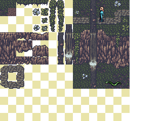
Ended up not looking tons like SO:BS, and I broke the GBC color limitations a couple times, but whatever. Will still probably be adding things, but sleep beckons. Sprites are there to demonstrate style (high saturation and two-tone shading, mainly; haven't decided if the sprites with this should be more detailed) and are half-assed. Likewise, some of the tile choices/positions in the mock-up are weird, but I was trying to cram in as many of the tiles as I could, so uh, disregard that.
Current: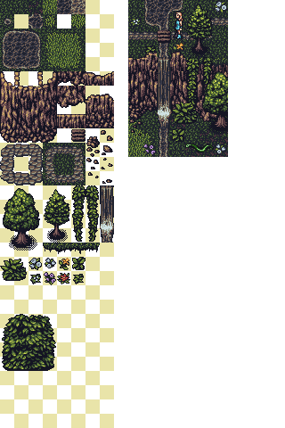
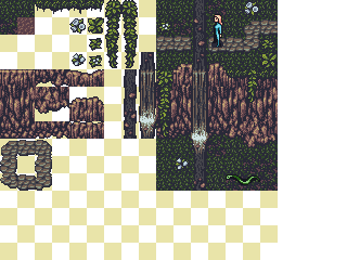
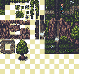
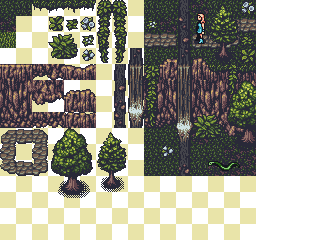
Saw some Star Ocean: Blue Sphere graphics earlier and was inspired! Ergo, this:
Ended up not looking tons like SO:BS, and I broke the GBC color limitations a couple times, but whatever. Will still probably be adding things, but sleep beckons. Sprites are there to demonstrate style (high saturation and two-tone shading, mainly; haven't decided if the sprites with this should be more detailed) and are half-assed. Likewise, some of the tile choices/positions in the mock-up are weird, but I was trying to cram in as many of the tiles as I could, so uh, disregard that.
Current:
 :
: 