Envision, Create, Share

Welcome to HBGames, a leading amateur game development forum and Discord server. All are welcome, and amongst our ranks you will find experts in their field from all aspects of video game design and development.

My new logo [please rate]

Hi everybody not sure if any of you peoples remember me but I have made a return... finally.
I have been out due to personal reasons in real life.
Anyway down to business

Some of you may remember the fact I was developing a commercial project called Wars Remorse. (note the commer thingy has been left out on purpose. Do I talk like I'mten years younger than I am... I probably do)


The game focuses on the realities of War and more importantly the emotion.
Now I was also having an exceedingly difficult time trying to create a logo for the game.
I tried to create something with a War feel to it, but failed miserably.
Instead I choose to ignore the fact of it being a game set in a time of War and decided to capture only the emotion.

What was created was this:

logo.png


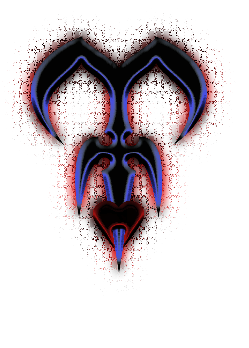
This was also sort of inspired by real life events too but I'd like everyone to kindly give critique on my full sized graphic. (obviously a tad smaller in the game title)

If you need more information on the subject just ask and I will enlighten you without revealing too much of the plot. :)
 
I dis-agree with you guys. I actually like the emboss, and that's really odd for me... All I'd suggest is change it from blue, maybe try like a silver/grey tint instead. And the outer-glow, maybe drop the size/ratio.
 
that's not a logo, it's a strange blob with a lot of PS effects.

logos will occasionally have effects. They don't necessarily HAVE TO have only solid colors. However, should there be an effect, it should be EXTREMELY understated, and only there as a means to make the thing "pop" against various backgrounds.

Your logo should be easy to define, no matter what color combination it's made of. Yours would not be. Hell, it's not distinguishable as anything now.

Clean it up and I'd go easier on you :)
 
Admitadly I was trying to achieve an illusion of 3D as I am not sure a flat one really suits the storyline of my game.

To answer Sonata it is a War set in the future but not a distant future, sort of around 2015ish, no actual precise year has been decided upon because the storyline actually swtches between the past and present. (The past representing his first mission in the Phase 1 forces and moves towards the intro scene of the game. The present runs occuring after he intro scene of the game and leads towards the final event)

The mosaic under affect is to sort of depict the mosaic of events that over time show revelations. I could however make that less noticeable.

Well nobody really complained too much about the shape so I tried in the style of KH:

http://i393.photobucket.com/albums/pp16 ... design.png[/img]

The misery feel though kind of dies. Anyone got any ideas?

Please say it as harsh as you like it won't hurt, I just request feedback in all forms. :)
 
http://i393.photobucket.com/albums/pp16 ... design.png[/img]

Much better, now you can use those layer effects on photoshop lol. Smooth up those lines a little, as the image was probably made on mspaint right so the (damn it, its the one at the bottom of the layer style windows, the one that puts an outline around a layer. If you split both colors onto seperate layers and put the outline on the outline shape.

Anyone else have an opinion on that? all I'm suggesting here is using a tool to smooth the lines a bit.
 
Do you know the name of the topic?

All help will be appreciated, just note as stated before this is for a commercial project and I am requesting free advice.
Also that I need to make it good enough to stamp on a commercial game.

@Alicix- unfortunately I don't have Photoshop but I can give it a go with what I got and see if I can perty it up a little with smother edges
 
Smoothed lines yes. That tile in the background no no no. Use it possibly on the title image behind the logo but not on the logo. It does not look good.
 
http://i393.photobucket.com/albums/pp16 ... simple.png[/img]

Ok just like that then.
Hmmm must just be me that thinks it looks good... Ah well I'm already using a mosaic affect for the MAZE logo so meh.
Do you think this is suitable enough for an emotion of depression and despair or any ideas?

The brackground is actually set to be a white background with broken peices of jigsaws appearing.

More suggestions are still gratefully accepted and thanks everyone for getting back to me so quickly!
 
If you really wanted to portray depression, dispair, giving up in society. Make the logo in a spraypaint effect. Ie, drippng etc, non perfect that way, you're saying that there is no control, no-one cares, and this is what people are faced with. for that, a single color would work.

Again, others opinions would hold more weight than mine.
 
http://i393.photobucket.com/albums/pp16 ... -paint.png[/img]
I tried to use just a paintbrush effect but I don't think it turned out quite good. Reminds of Water.

Other than that I tried a Ghost type look:
http://i393.photobucket.com/albums/pp16 ... -ghost.png[/img]
then realised on a background that only changed periodically the semi-transperances would be naught but pointless.

Either way I must thank you Alicix and Mascarpone for the advice and help. I will wait for other suggestions too but I noticed myself it's starting to look more appropriate for a game. :)
 
Im back, in my opinion the paintbrush efect would look better on a metal surface, as if someone had done blow torch art? If that was done, it'd have to be done in oranges like rust or something.
 

Thank you for viewing

HBGames is a leading amateur video game development forum and Discord server open to all ability levels. Feel free to have a nosey around!

Discord

Join our growing and active Discord server to discuss all aspects of game making in a relaxed environment. Join Us

Content

  • Our Games
  • Games in Development
  • Emoji by Twemoji.
    Top