Why does it look so much like you just editted the Breeze Template? O.o
It's got the black shadow ring under it's feet, the shading's the same, the palette's the same, even the outlines just look smushed and stretched from the original Breeze ones.
If you're going to edit, copy the style of, or use a template as a reference and they come out looking REALLY similar then you need to credit it so you don't get lots of "THIEF! >=[" comments
")
Anyway 3 main things I notice:
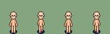
1. It's tall and smushed. It's too thin for it's height and looks like a stick, so either make it wider or make it shorter
2. It uses Breeze's palette. I know, I already said this but it need to be said again. When a good spriter releases a template their palette VERY rarely works on other templates. Go stick a Breeze Palette on a HK and you'll see what I mean xP
3. The eyes are up to high. While this may just be preference, I always find that the eyes look odd when they're stuck right in the middle of the head like that. I think it'll look much better if you move em down one pixel.
So just fix those little things first then I'd re-shade it yourself WITHOUT the help another template for reference(unless you get REALLY stuck). That way it'll be more yours and it's good practice.
^_^