Envision, Create, Share

Welcome to HBGames, a leading amateur game development forum and Discord server. All are welcome, and amongst our ranks you will find experts in their field from all aspects of video game design and development.

my art museum

C & C are welcomed
magician1bi6.jpg
54459720zc0.jpg

I want to develop my skill, I know my drawing was pretty weird at this time, so that I hope I hope all your comment can help me in developing my drawing skill.

sorry I've lack of paper so I use the used one, :tongue:

thanks :wink:

I CHANGE THE TITLE, IT IS BECAUSE I INTEND TO PUT MY DRAWING OTHER THAN MANGA.
note: the old title was "my manga drawing"
 
these are amazing! i just don't understand why you had to link from my post... lol, i noticed a cofee stain in the first picture. these are cool though. i like ur drawing style.
 
actually I draw that 2 images because yours was inspiring me, so I post them in your thread, but then mila2 said
mila2":lztc2ara said:
wow ice you bested us both you d bag if you read this post
it says make your own art forum
I don't understand what "make your own art forum" means, so I just moved my images to my own thread, because I am afraid, posting my image in your tread is harmful/violating the rule..

sorry for a bad grammar.

to tell you the truth, that is not cofee stain(I don't drink cofee), but that is a shit from an animal that usually walk on my wall, kind of lizard but it skin is yellow (sorry I don't know what this animal called in english :tongue: )
I lack of paper so use the used one, and I don't have any scanner and internet in my house, so I just come to public internet(a place you can use the computer and internet but you must pay..) poor me :blush:

sorry for a lack vocabulary..
 
I like the outfits you made. mostly for the witch. :biggrin:
It looks like it's just a draft so I think it looks awesome when inked and when it's final.

For me the guy's armor in the front makes it look like its hard for him to bend over.
 
wow.. thanks for the comments..

I inked the images, I use photoshop 7(pretty old isn' it)and it is my first time inking my rough draft(usually I draw & ink the image directly using macromedia flash, but the weakness is, I do not have any stylus tablet so my drawing look not that good,)..

and I realize that inking was so difficult and taking a couple of hours, comparing with drawing a draft that just need less than one hour.. but inking have much more fun rather than drawing.

ok, let's have a look!
mag1.jpg
knight.jpg

feel free to comment and critique..

oh, yeah.. can some one told me how to make it final(doing a good finishing touch..)?
I am beginner on it..
 
Mascarpone":28ov93kl said:
ew! what did u draw those on, homework assignments?? Shame on you! get a fricking sketchbook.

Lol Masc and his pen tool. But hell no use what you got! I drew so much stuff on my assignments when I was bored its pathetic. Hell I'd get credit for drawing nice things on them. :D And then occassionaly you'd get the penis or two. Hahaha.

One thing I must say is you have a unique way of doing things. I just wish it wasn't anime/manga. To much of that shows up and its hard to really stand out when all the styles are similar. :p

Invest in realism for a while and it'll help you to further your voice as an artist. You're up to a great start its just you're in the wrong race.

If that makes sense?
 
Hmm....interesting.

Overall I'd say it's not too shabby.

If you want me to critique a little, I would note the witch's right leg (your left). It appears to be a little....squished, at the kneecap joint. Could be just me though. I like clothing design she has.

Her hat is probably what sticks out to me the most -- you could take that into consideration....does it speak? Or have a personality? Or is it....cursed? Who knows.

As for the Knight, he looks just a wee bit plain. The armor shape is well defined, but there isn't anything that makes him "stick out". If he was standing in a line-up of other manga-Knights, I wouldn't look at him and say "wow".

I do like his a-symmetrical shoulder pad. That does add some interest to the pose. If you want to make him "pop", I would add a little flare to the armor in terms of texture. Either that, or throw on some type of crest. Does he serve for a kingdom or any particular cause? If so, wouldn't an indication be present on the armor?


Here I go again, babbling on forever. Keep up the good work, iceblue.
 
yeah.. finally I got critiques..
I like critiques very much...
please gimme more critique,

Mascarpone> don't know why, but drawing in a clean blank paper, make me a little bit nervous, so I decide to make a rough draft on the used paper, but then when I finish making the rough draft I am getting lazy and bored to redraw it on the clean one.
actually, my aim inking the two images is just want to try and know feeling inking in PS. it is my first time..

Makasu> good Idea! thanks. usually I need model in drawing realism.

FallaciaSonata> please critique me more :biggrin:

but don't worry, for the next image, I will draw it carefully in a clean paper, and also carefully inking on PS. today I read many tutorial and I'll apply it later on my next art..

thanks all :smile:

could someone tell me how to make signature correctly, mine wont show up, I dunno why..
 
This is my realism, I think it is enough for making you know that I don't have any talent on drawing realism,
sorry, once again I use the used paper :blush:
trialo.jpg

comments and critiques are welcomed!

could someone tell me how to make signature correctly, mine wont show up, I dunno why..
 
Hmm....

Looks pretty good. Proportionally, I like it -- minus the eyes. Something is off about them. One or the other is too big or too small, I think.

The cross-hatching shadow is nice, good amount of contrast you've got there. The manga figure is in good proportion as well.

I would watch out for the features on the face, though. How old is this character? His teeth look like that of a child's -- they're kinda small. His eyes also suggest a younger age. In addition to those, he has a hairline closer to the top of his head and a very well-defined cheekbone, suggesting he is older.

I dunno, it looks pretty good. :thumb:
 
thanks, for the comment, I can use that as a reference to draw the next art. I hope you're not bored with mine...
the one in realism is about 34 years old.

my drawing once again come in used papers.. I am not buying the new paper yet :tongue:.
I draw these 2 images before the realism one.


75117121.jpg
sorry I cut and paste and merge them into one paper because more paper to scan means more money to pay.

52982351.jpg
these two are just rough draft. I intend to color them on this weekend.

feel free to leave comments and critiques. :biggrin:
 
your feet aren't in perspective D:

remember perspective, it's important. Since in most drawings of people your focal point is around the waist or chest you should be able to see the tops of the feet. they shouldn't be doing this flat-to-the-ground-oh-look-at-the-hump-things that you've got going on.

other than that they're decent but i like the realistic stuff allot better.

and please get a sketch book T.T


edit: masaku: My pen tools have nothing to do with sketchbooks D:
 
As an anime fan, myself, I really like them. The feet are fine for an anime character, which aren't known for their "perspective".
On the constructive side of things, you could tone down the calf muscles just a hair. Too defined and it looks like the leg is sideways.

All in all, great job. Give me a clean scan and I can color it for you.

Edit: and Rosario + Vampire kicks a$$.
 
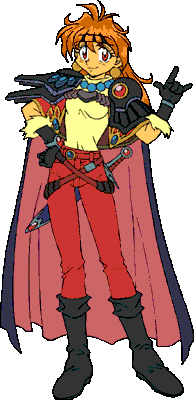
actually even in anime feet are in proper perspective thanks.

lina-trans.gif
Foot perspective.

naruto-kid.jpg

ta da. tops of feet.

goku28.jpg

Good golly, miss molly, feet in perspective :O!

they look find on the reaper and the knight but it's all a mess on the girl with the messenger bag and the witch.
 
theory : I just read your comment today and fortunately I bring the clean version of some of them.. I done them when I home last weekend.
sure, you can color it.

Mascarpone : thanks for the critiques, I like them, now my eyes are wide open on feet perspectives thing,
recently, I do realize that a sketch book is really important, I know it after I scan the images above. without sketch book, I really got a terrible result. but I still prefer a used paper for training..
sorry, maybe I will fix(repair) their feet on the next weekend.

too bad, I save my images in .png file with transparent background, but when I upload it, the images become just blackout with nothing inside :shock:, and unfortunately I have no PS to fix this problem here, maybe I will fix them later when I home that means seven days from now :cry:.
while waiting that time comes, could some one PLEASE tell me how to fill signature appropriately and correctly, mine won't show up.. I just don't know why..
 
first remakes
heiluna.png
witch1.png
I done these two in MM Flash 8. :fap:
Sorry I have not repair their feet yet, I remake them before I read theory's Mascarpone's comment about perspective that are good and useful.

please feel free to leave comments and critiques.
 

Thank you for viewing

HBGames is a leading amateur video game development forum and Discord server open to all ability levels. Feel free to have a nosey around!

Discord

Join our growing and active Discord server to discuss all aspects of game making in a relaxed environment. Join Us

Content

  • Our Games
  • Games in Development
  • Emoji by Twemoji.
    Top