
You are using an out of date browser. It may not display this or other websites correctly.
You should upgrade or use an alternative browser.
You should upgrade or use an alternative browser.
Logo - C&C
- Thread starter kidd6686
- Start date
Too busy indeed. The Japanese font is unnecessary, unless you're either actually providing content aimed at a Japanese audience, or trying to be Japanese (for the sake of humor, more often than not). It doesn't seem like it's either of the two, so I think the logo would be better off without it.
The square thing, I don't really get. It just seems like a pointless ornament to me. The dot on the I does look like a G. May I suggest you draw something more spiral-like - the sense of motion it gives off should better accentuate the company/team name.
Putting some color in would be nice as well. Maybe some warm or cool colors, I'm not sure which. Play around with it more, I guess. It doesn't have to be really colorful, but I think the plain black's a little dull.
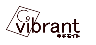
Here is the new updated logo hopefully not too busy now.
*Removed the square.
*Also changed the circle above the "i".
*Added a fade of red.
*The font was requested by my co-writer. Which derives from his origin. He will also be translating the game into japanese for me ^_^; So as you see why its like that the original logo was the same set-up except english font.

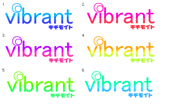
Oh sweet jesus, my eyes! =P
Those colours won't win you any awards. Looks too faded.
Have you considered a black background? Otherwise, you could try a similar set-up to the second attempt, but using pink instead of red, and colouring one of the circles above the 'i' pink too. For some reason pink makes sense to me when it's aimed at a japanese audience, but that's just me! Other than that last colour scheme though it looks great. Just fix up those circles above the 'i' like Kraft suggested. Unless you've done it already, can't really tell when they're bright yellow =P
dadevvtsvre
Sponsor
Oh geez. Lose the blinding yellow/blue, it's much worse. The red looked alright to me, although a bit more saturation would do wonders. (as others mentioned, to make it more "vibrant") Use a colour wheel and experiment a bit to see what works good together.
You could try a sort of glossy effect, as the font sort of gives me the impressions of modern and clean. The simpleness is what really works for it though, so if you add any extra effects don't overdo.
You could try a sort of glossy effect, as the font sort of gives me the impressions of modern and clean. The simpleness is what really works for it though, so if you add any extra effects don't overdo.
Thank you for viewing
HBGames is a leading amateur video game development forum and Discord server open to all ability levels. Feel free to have a nosey around!
Discord
Join our growing and active Discord server to discuss all aspects of game making in a relaxed environment.
Join Us