Envision, Create, Share

Welcome to HBGames, a leading amateur game development forum and Discord server. All are welcome, and amongst our ranks you will find experts in their field from all aspects of video game design and development.

Frizzle's Pixels

Dumping some stuff I've done over the last few months. Comments/Critique welcome. Most of this has been done on for my Fiverr Account as well as for a Portland based webshow called Permanent Comedy.

MJO_zps37cd4cca.png

Andrew_zpse65e48e2.png

PortraitMantis_zpsce7b6f55.png

Portrait_zps9bced40e.png

ToddSittingHaircut_zps472d4b7d.png

JT_zps33086f2c.png

JN_zps5ce43d3e.png

TT_zps3779f96a.png

GJ-Guest_zps090792cb.png

KC_zps516dc6df.png

JB_zpscef0d8ab.png

BWD_zps0cacfde6.png

JC_zpscecd282c.png

Greg_zpsf2b8d537.png

AJ_zps5ce130eb.png

MJE_zpsd455d155.png
 
Thanks! Been trying to improve my skills so I could hopefully build some assets for my game or partner up with someone for theirs.
Here's two more:

Studio_zps4d1169d4.png

Helium_zps6b089ddf.png
 
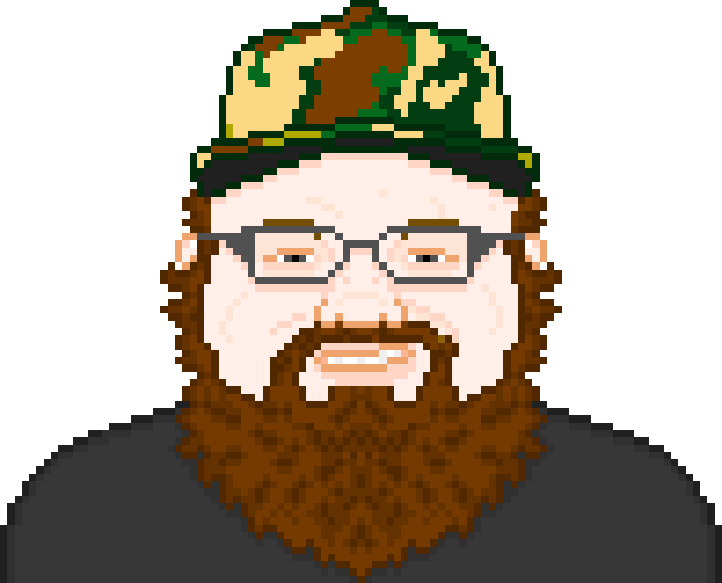
Looking good! It's a nice, clean style that should be easy to produce assets for. The two main suggestions I have are to watch the gradients (in particular, the one on the car sort of clashes with the curved outlines) and to be bolder with your use of colors. Right now, it looks like you just use a darker and lighter version of the same hue for shading, but I think mixing that up would add a lot of energy to your work. Vary your hues more; shadows should usually be cooler and less saturated than highlights, and they should typically gravitate towards a common global shadow color, e.g. a dark purple or blue. You can also do the same with highlights if you ever do more complex shading.

Your simple, flat-shaded style kind of reminds me of Syosa's:
alice.gif
chesya.gif
comp9.gif


His use of color is excellent, and you should consider studying it. Here is an interview with him where he talks about his style and how he picks colors. This diagram in particular illustrates what I mean about unified colors:
pallet.png


As far as the gradients go, I would consider experimenting with minimal use of shadow colors (again, Syosa's work is a good reference) instead of gradients. It usually looks cleaner with simple, bold pixel styles, although it does take more time, so that's a tradeoff you have to consider. Another thing that would add a lot is doing some anti-aliasing around your dark outlines to make them look smoother, but again, that takes time. The first image of Syosa's there is a good example of what I mean, though.

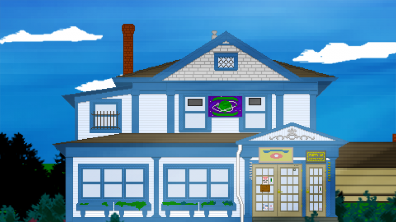
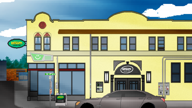
slym comes to mind as an artist whose environments you could draw inspiration from, although his backgrounds are maybe a little more complex than what you want:
tavern_screen.png

a9d8f7sdf.gif

Look at the wood and the bricks in particular. The shading is very minimalistic but implies texture.
 
Thanks for the tips and links. Definitely great stuff to look at and learn from!

While working on this stuff, I've also been messing around building some tile sets for RMXP and testing them out by animating them in Photoshop/Motion.
The idea is to make something at least once a day so I'm hoping to update this regularly.

PixelAnimationTest_zpsa3942b41.gif


http://www.youtube.com/watch?v=7mZ2Sb3yxac
 

Thank you for viewing

HBGames is a leading amateur video game development forum and Discord server open to all ability levels. Feel free to have a nosey around!

Discord

Join our growing and active Discord server to discuss all aspects of game making in a relaxed environment. Join Us

Content

  • Our Games
  • Games in Development
  • Emoji by Twemoji.
    Top