Envision, Create, Share

Welcome to HBGames, a leading amateur game development forum and Discord server. All are welcome, and amongst our ranks you will find experts in their field from all aspects of video game design and development.

Eeep...I'm not very good but I'll post my stuff anyway...

Alright so I'm looking for critique on some recent stuff I've done...

Comic I wrote:
cosplaycrisis-1.jpg

cosplaycrisis-2.png

cosplaycrisis-3.jpg

cosplaycrisis-4.jpg

cosplaycrisis-5.jpg

cosplaycrisis-6.jpg

cosplaycrisis-7.jpg

Digital Arts(yes these are huge because I drew them that way and they're linked from DevArt):
Squall_Contemplation_by_SorceressKyrsty.png

CC_Comic_Cover_O_O_by_SorceressKyrsty.png
This is the 'front cover' for the comic. I know the background sucks and I forgot Levi's (the brunette) sock :/.
Rinoa_Heartilly_Realistic_by_SorceressKyrsty.png
God I suck with hair and noses :/
 
they are really, really big. It is hard to actually look and critique them if I cant see the whole thing, or at least half of it. :)
 
My first thoughts are that they are pretty decent compared to some of the other stuff that ive seen floating around the anime pool. My second thoughts are that you should probably get a better understanding of the art of drawing the human body and maybe lay off the amine for a bit, everything starts with a good foundation and if you master the basics of proportion and perspective and everything else that comes with drawing anatomy maybe you could develop your own stylistic ways of incorporating your swing on it and create a totally unique style art. Instead of just mirroring other amine artists. Other than that it looks like you're on the right track, all i can say is god speed and keep practicing

edit: Another thing, i saw the title, "im not very good bla bla bla" Dont ever be ashamed of your art, dont apolagise for it, if you did your best nobody can fault you for it. Try to take the critiques and become a better artist because of them.
 
You seem to be suffering from "random stroke syndrome" and "sketchy stroke syndrome". Tentative artists, ones who lack confidence, tend to make little "stabbing" motions in their strokes, to make up for an unsteady hand or an insecurity in their linework.

The best thing you could do is to become more confident in your strokes. Practice making broad, sweeping strokes. Practice drawing circles and straight lines without ever lifting the pen. It sounds easy but to most people, it's incredibly hard. You need that steadiness and confidence in your hands as a foundation to make something visually appealing. That's the first thing an art teacher will tell you is that you are banned from using tiny "stabbing" strokes in anything outside of gestures or very quick roughs. It ruins almost anything.

And, like Badmonur says, start with real life or simple objects and then cartoonize it. Don't start with things that are already cartoonized. You'll never learn true proportions, movement, or style development that way.

When you start out drawing anime, it's like you're trying to forge someone's signature before you even learn to write. First you learn how to draw the letters, then you learn cursive, then you develop your own variations. That's developing a style. "anime" isn't just a broad style, every anime and manga is developed by a different artist with their own style (though a lot of it is very similar). Your trying to copy it without knowing the foundations is only setting yourself up to being able to copy it, and not actually learn how to make your own.
 
not really much to say on my part that hasnt been said by ven and bad as far as pointers on improvement. so ill give some words or encouragement instead. i think that youve got some unrefined talent and with some guidance and practice could become quite good. it seems you have a pretty decent understanding of lighting and color. like in your drawing with the 3 characters, you keep a fairly consistent light source across all 3 of them. i wanna say youre a little ahead of the curve for your age (which im guessing is in the 12-15 area). you just need to keep on plugging away, practice and learn as you go. listen to people who give you pointers and try to improve on your weak points and youll notice a steady improvement as you develop as an artist.
 
Thank you all very much for the critique C=. I find it really helpful when I get solid critique, and ever since I read Venetia's comments I have been working hard to stop 'sketching' everything but my bases, which never really show up in drawings anyway :/. As for the anime style, I know about that. I've been trying to develop my skills in anatomy by studying people in everyday actions. It's rare that I sketch them down because it's often at school I do this, and teachers dislike me sketching in school. When I first started drawing around 3 years ago, I borrowed out books on drawing and often found that they didn't help me whatsoever because they were very 'their style' and I find it slightly difficult to copy others (I find it pointless to completely recreate anothers work). When drawing my anime, I try to find alternate ways to draw the eyes while still fitting it into the 'anime' envelope.

This is a digital drawing I did yesterday. I'm not happy with the lines on the light edges of the hair AT ALL, and I reckon they can go die. I shouldn't have changed it *sigh*.
Kumo_Atsureki_by_SorceressKyrsty.jpg
 

mawk

Sponsor

the hair is overshaded compared to everything else. it looks as if you've placed a hair-shaped object on top of an otherwise flat drawing -- I think this is 'cause you actually change the color of the outline on the hair to accommodate the shading, but you don't do this anywhere else in the picture, so it's not really congruent all the way through.

his ear is pretty small and awfully close to his eyes given the angle of the face, too.
 

NexS

Member

i'm sorry...but

WHAT PART OF TOO BIG DONT YOU UNDERSTAND??


now thats out of my system, where do all these digital tablets come from??!?! every one has one these days, and i still have to draw on paper with my trusty pencil!

makes me sad, really
 
Actually I bought my graphics tablet in a shop for $160. I usually use it for line art etc once I've done the basics, which I do outside of the computer in pencil. I feel that looking at the figure as a whole instead of zooming in and out gives me a better grasp on my anatomy.

Sorry I haven't posted in a while guys~

Volume 2 of Cosplay Crisis Cover:
LeviCCComicCoverVol2-1.jpg

Kumo:
Kumo-resketch.png

WIP:
wipping.png
 
The colours you used on the skin on the second one there are excellent, especially that bit of red at the bottom of the face. It really makes the skin look like skin. The colours on the first are rather flat and lifeless but I'm going to assume you drew the second one after the first one and that means you're improving which is great!

You need to practice shading hair, I think. You're at two extremes right now, the first one's underdetailed and looks flat as a result but the second's overdone and looks like you just scribbled. Remember what Venetia mentionned before about confident strokes, it applies to colouring as well as just drawing. Try to have more confidence with your strokes and keep in mind the direction that the hair's going in. And don't worry too much about drawing every strand of hair/making it look 'hairy', aspecially when you're drawing anime hair. If you overdo it it just makes it look like the world's worst case of split ends.

The colours on the third one are a bit lifeless again. Look at what you did with the skin on the second one, you really did do that brilliantly, and try to do it again.

As a side note, drawing big is a VERY GOOD THING, it never makeswork worse and makes corrections/adding detail a lot easier. But it's important to resize it, too. It's difficult to appreciate things when you can't see all of it at once.
 
LeviBackground.png

I tried to do a little perspective after I saw an image. It started out as a pen sketch but I recognized the problems in the drawing an fixed it before I moved to colour. Initially he had a sword in his hand but it looked bad so I got rid of it.

....I really suck at backgrounds.
 
I quite like this. The only criticism I will make, Is of the actual comic at the top of the page, In the black and white strip, Is the backgrounds. Quite a few of the panels lack anything going on in the background... Kind of like too much treble and not enough bass, if you get what I'm saying.
 
Yes, I see what you're saying. Those pages are rather old now, I've been working hard on my backgrounds. I try to give a little perception to where they are in most of my recent works. (I'm up to about page 14 of the second chapter, there's another 17 non-digitized pages of the first chapter to go with the other 9 I have up there). Looking over chapter 2's pages, just about all panels that are wide shots that need backgrounds have them.
 
you should take a look at lagacyX's thread and take a lot of the advice myself and other have given him. you really really need to bone up on anatomy. not to be too harsh, but as far as anatomy goes, youre really pretty bad, and youre not gonna be getting any better by just drawing anime.

ive seen to many of you youngsters who fail to head the information and guidance of people who have a real art background and continue to pump out poorly drawn anime drawings one after the other with little or no improvement. the only way youre going to get better at drawing the human form is to study exactly that, the human form. not simplified or stylized, but real actual human anatomy, learn the foundations first, then develop a more stylized approach.

take it as you will, im just trying to help you improve
 
Yes, I see where you're coming from. My anatomy in the comic is freakin' horrible and quite a few of the others are bad, too. The comic, however, is extremely rushed and not a proper example of what I can do. I don't draw just anime, I do draw other stuff and even when I do draw in an anime style I do try to keep a sense of realism in there by not drawing overly large eyes etc.

I decide to try and draw something a bit more realistic and I came up with this:

IMG_0001_NEW.png
 
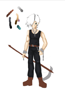
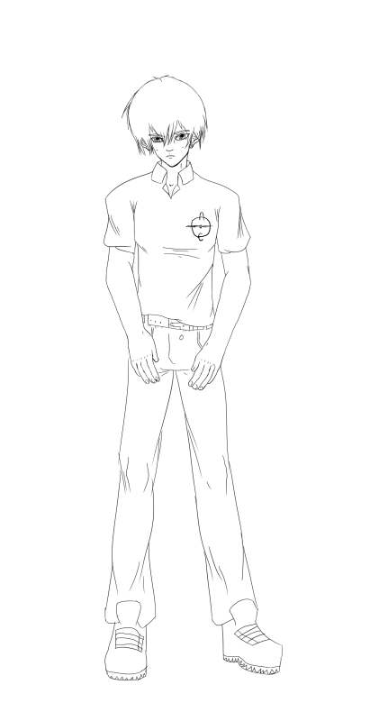
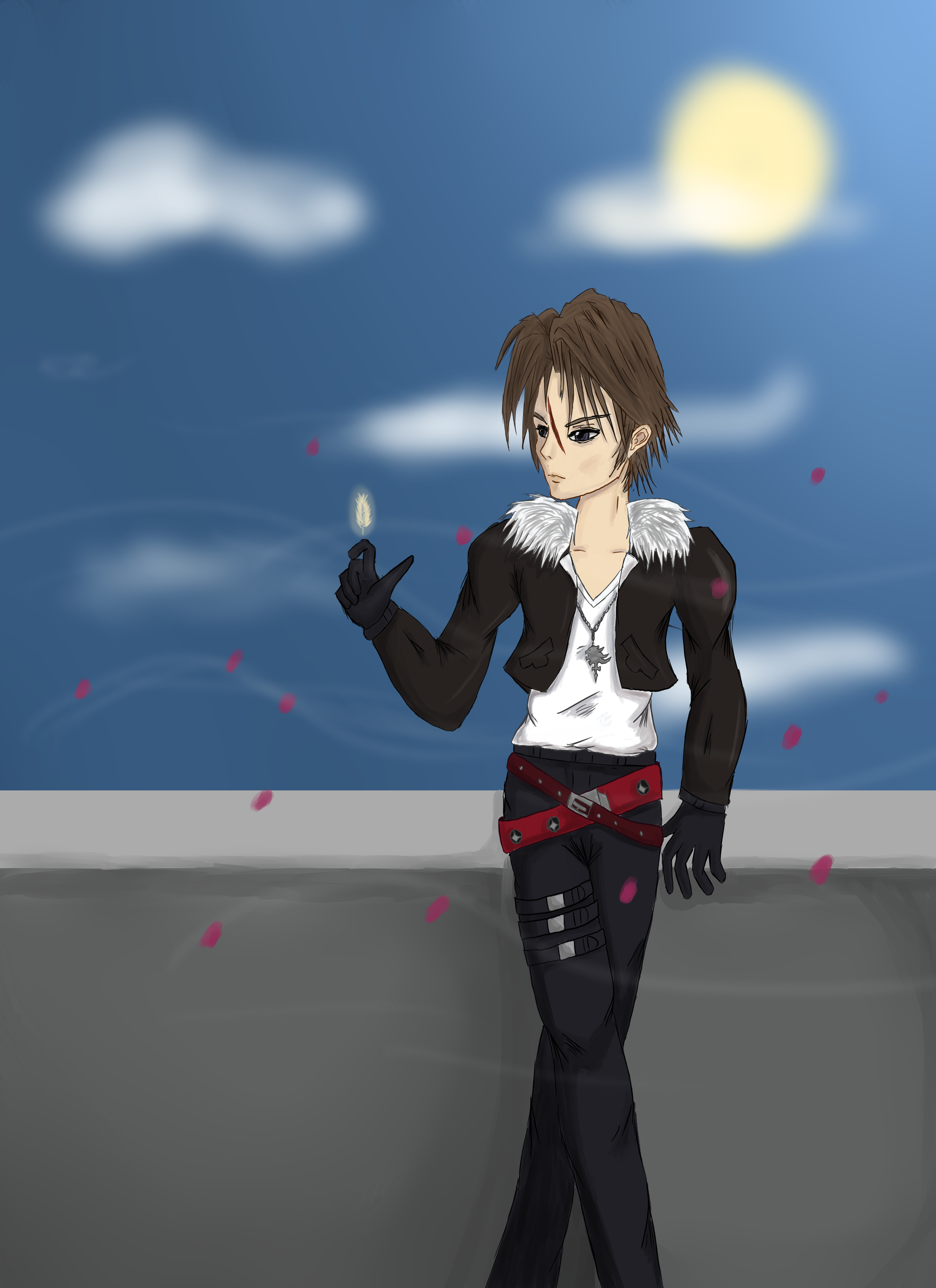
alright, ill say that the linework is clean, not a bad little drawing

now, to point out some things. first off, that drawing isnt realistic in the least, its very much anime, there are a few things anatomically incorrect with it, most are minor, but the arms are a big one, theyre much too short.

other things i notice wrong or poorly drawn are:

pants, the shape doesnt look like right in general, the folds are off, the cuffs are the worst part, second on the list of worst to best is those knobby ass knees and the way the cloth is around them, look at some reference and take note of how pants of differing tight/looseness fall around the legs, study it, draw it, get better, $$$.

the feet....i dont really have to say it do i? it looks like you just gave up more and more the lower on his body you get.

last but not least, while the torso portion of the shirt is drawn well, the sleeves are not, again folds and cuff are badly done. and again, reference.

and a few minor things, pockets are too narrowly spaced. what i assume is the button (if thats a button) is in the wrong spot, it would be behind the belt thus not drawn at all, and also it would be centered above the fly. the hands could use work, his right (your left) is drawn better but still could use improvements. his collar, doesnt have a part where it buttons down, dont know if this is on purpose, but im just throwing out things i notice.

also the belt is off center, but i assume you drew it that way on purpose.

all in all, not bad, but needs some polishing, i think the biggest thing you could do to improve is to draw from life. study reality. and some words of wisdom an old art teacher i had many many years ago said. "draw what you see, not what you think you see" Mrs. Nelson. and if you take its meaning and apply it to your art, i think youll take note that you tend to do a lot of drawing what you think you see.

long post, sorry, but take from it what you can, im not trying to rip your drawing appart and talk down to you or anything, just trying to help a budding artist improve.
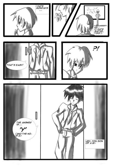
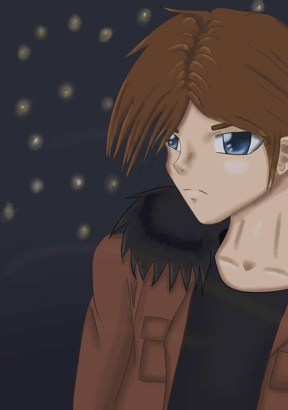
 
Alright, so I've decided to do some studies, especially in perspective, anatomy and life-drawing.

My first study was to print-screen a shot of Heroes (I was re watching the very beginning of Season 3, which didn't start out too bad)
Peter Shot:
MiloVentimigla-Ishegonnabealright-.png

And then I tried to copy it. I didn't have a rubber at the time I drew this so some lines are sketchy, but it's meant to be a sketch anyway C=.
IMG_NEW.jpg

And as you can plainly see it didn't work out so well. *sigh* Better luck next time. Might try sketching my mum, sis etc while I'm away (I have to go to my Mum's every holidays and there's nothing to do except draw and write...on paper...and read the newspaper...)
I can point out a million errors with this, and as a developing artist I suppose that's alright given I improve next drawing.
Work In Progress: Draw better eyes!!
 

Thank you for viewing

HBGames is a leading amateur video game development forum and Discord server open to all ability levels. Feel free to have a nosey around!

Discord

Join our growing and active Discord server to discuss all aspects of game making in a relaxed environment. Join Us

Content

  • Our Games
  • Games in Development
  • Emoji by Twemoji.
    Top