Envision, Create, Share

Welcome to HBGames, a leading amateur game development forum and Discord server. All are welcome, and amongst our ranks you will find experts in their field from all aspects of video game design and development.

Custom Tiles WIP

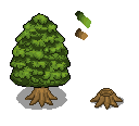
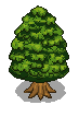
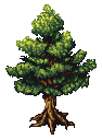
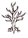
I haven't done much spriting for a while, so I decided to make a few tiles. Please, don't use these, because I don't think I'll be releasing them. I want some C&C on what I've been doing.


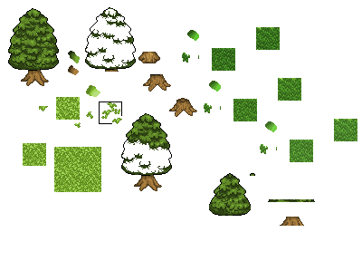
I apologize on how this is layed out, it's just how I have it in paint. It's showing a few tiles and things. Although really, the only things complete are the tree and the two different types of grass.
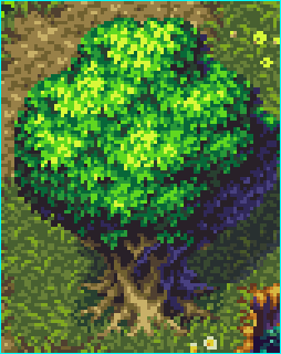
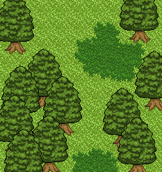
Here's a quick example of the tiles:


Next I'm going to be making some houses and cliff faces. I'll update the topic once I have.
 

Jason

Awesome Bro

Hmm, something bugs me about how flat the bottom of the leaves on the tree are, and how the trunk/roots seem a little short. Also, shadows wouldn't hurt the trees :wink:

As for the grass, I like the dark grass, but something bothers me about the lighter stuff, but I'm not sure what that is exactly.
 
I think the tree could use a little defining on the leaves and highlights so it doesn't look flat. And something bugs me about the grass tile, it seems a little to busy.
 
Hey, thanks for the comments
@jbrist: Do you mean the bottom of the tree, or all the leaves? I'll clean the shading up a bit on all of it anyway. To be honest, I'd completely forgotten about shadows of any knid, so I'll be adding them in as well. I think the problem with the light grass is, as 006 said, it's too busy. I think it kind of looks like lots of leaves all over the ground. I'll have another go at that, too.
@006: Again, I'll clean it up. Thanks for the comment.
@LunarEclipse: Yeah, you would. However, I'm not really designing these to have character's wandering around. The original idea behind this was something like a world designer/creator. That's why everything is quite small.

I'll get to work on the new stuff and edits right now.

EDIT: Ok, I've smoothed out all the shades, and added more shading to the leaves. I've also added a shadow and remade the trunk. Is this looking better:


Jason

Awesome Bro

Yeah, that tree looks so much better, however, I was talking about the bottom of the tree, just didn't know how to say it, lol. Also, the trunk looks better too, nice work with that.
 
The tree looks flat in my opinion. Maybe because in the screen, you use black as it's outline. It looks sorts of reminisce of rm2k/3 graphics. Great tiles you have there, fox! :thumb:
 
Yeah, the tree is really flat, and the black outline doesn't help. Maybe some highlights down the middle left to add some dimensionality to it instead of everything being shaded the same everywhere. Also, your palette could use a lot more contrast, and the colors are a bit dull. I recommend adding more yellow to the highlights and more blue to the shadows, too.
 
I'm no Pixel Artist, but I reckong you should curve the bottom of the tree a bit, so it looks more round. Also, can I please use this to learn how to make a tree?
 
Right. I've done another edit.
@jbrist: Ok, great, thanks. Hopefully I've fixed that now.
@impreza: Thanks. I ment to take that black line out, and forgot. Removed it now.
@Perihelion: Ok, I changed the pallete, but I'm not sure what you ment about highlighting the tree. I hope my edit looks better.
@Vazoh: You're right. I've changed that as well. And, sure, you can use it to learn, but it's not the best example of spriting by a long way.

So here's the latest version:


Comments?
 
That's look a lot better, natural and more tree-like. But I can see some black outline on the leaf...but it's not that visible. Anyway, nice effort man...!
 
It's better but still flat. I think your problem is that you're shading the same everywhere. In the parts that are darker, don't use some of the highlight colors, and in ones that are brighter, use more of them. That kind of variation will help add dimensionality.

Check this out:
5-8.gif

You see how the shading isn't uniform? The breaks in the highlight create the illusion of layers, and the brightest colors go away as the edges of the tree recede into shadow. Also note how there's more of the brightest yellow in the highlighted areas on the left, which is closer to the light.

For a cruder example, here's something I did, plus a WIP so you can see how I constructed the highlights:


The highlights aren't necessarily placed exactly where they should be, but you can get an idea, I guess. Also pay attention to the colors in these examples (particularly the SoM3 one), as yours are still really dull. Add more contrast and more hue variation.
 

Thank you for viewing

HBGames is a leading amateur video game development forum and Discord server open to all ability levels. Feel free to have a nosey around!

Discord

Join our growing and active Discord server to discuss all aspects of game making in a relaxed environment. Join Us

Content

  • Our Games
  • Games in Development
  • Emoji by Twemoji.
    Top