
You are using an out of date browser. It may not display this or other websites correctly.
You should upgrade or use an alternative browser.
You should upgrade or use an alternative browser.
Contest Screenshots Thread
- Thread starter Ellie
- Start date
I will update these as I complete updates to the main thread and project. Hope you enjoy! I want to see more posts!
Initial Demo Map

Demo Map1- Deck IV- Storage Area I

Demo Map2- Deck IV- Storage Loading Dock

Current Map- Deck IV- Storage Area 1

Current Map- Deck IV- Storage Loading Dock

Current Map- Deck IV- Repair Shop

Current Map- Deck IV Storage Loading Dock

Current Map- Deck IV Main Storage Lift


Demo Map1- Deck IV- Storage Area I

Demo Map2- Deck IV- Storage Loading Dock

Current Map- Deck IV- Storage Area 1

Current Map- Deck IV- Storage Loading Dock

Current Map- Deck IV- Repair Shop

Current Map- Deck IV Storage Loading Dock

Current Map- Deck IV Main Storage Lift

OrigamiRose
Member
Looks good, but the dark screenshots is way to dark. I can't see anything att all on my laptop.
Added this one in the main thread aswell:

Added this one in the main thread aswell:
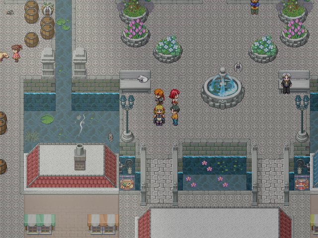
@OrigamiRose - I would suggest to change the alignment of the windows on the bottom left building. They look a little awkward on the edges of it like that. Other than that, it looks pretty good! There's enough going on to make it actually feel like a town. 
New screenshot:

Updated some graphics and stuff in my demo (link to thread).
New screenshot:

Updated some graphics and stuff in my demo (link to thread).
StrawberrySmiles
Sponsor
I'll enter this screenshot I guess:


Jumping Jack Flash
Member
its a bit hard to see the screenshots but usualy when their this dark its easier when your actualy playing the game. movement and things help. things only look dark because you cant see anything happening. I think it will be fine. -injury
thatbennyguy
Member
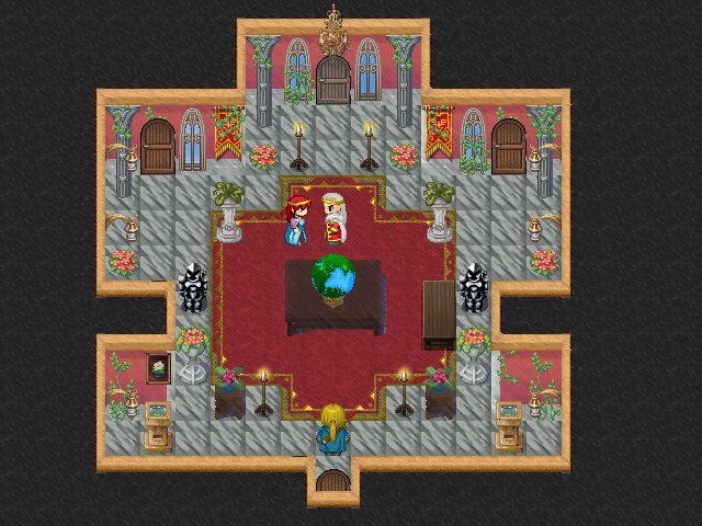
Xilef":287tmjru said:I'm guessing that's a custom made tileset?
If you're looking for some feedback, a lot of those elements have soft edges which makes them blend somewhat together, I'd go around all your elements with a dark outline to make them standout.
I wouldn't. I like the aesthetic of soft edges, and it's better than the people who put absolutely dark edges on all the graphics they see. Perhaps a little darker on the outline, but that's it. Right now it has a kind of pastelly effect to it, which is actually kind of nice.
Edit: Mind you, the biggest offender would be that the bottom of the wall fades with the ground. Probably put a dark outline around that.
And the globe, the edge of the table, around the flowers on the brown desk and the character's head-wear.thatbennyguy":22xonr84 said:Mind you, the biggest offender would be that the bottom of the wall fades with the ground. Probably put a dark outline around that.
Darkening the outline doesn't equal cartoonification, look at most pixel-art work such as this one I found on Google images:

It doesn't have to be this level of outlining[/img], just something that gives edge definition.
Thank you for viewing
HBGames is a leading amateur video game development forum and Discord server open to all ability levels. Feel free to have a nosey around!
Discord
Join our growing and active Discord server to discuss all aspects of game making in a relaxed environment.
Join Us


