Envision, Create, Share

Welcome to HBGames, a leading amateur game development forum and Discord server. All are welcome, and amongst our ranks you will find experts in their field from all aspects of video game design and development.

Colouring Artwork with Photoshop

Now, this is my first attempt at something like this but still I'd like people to give me honest opinons. No trolling or flaming please, just some decent critique that shows some courtesy towards me. I've essentially tried colouring in a black and white piece of artwork from my game using photoshop. It's my first attempt at something like this and I hope it's good. Please tell me all the positives and all the negatives and be honest with me.

KeirosArtAttempt.png
 
I wont get into the nitty gritty of the anatomy but it seems that your pallet is a bit saturated, its too....how do i say this, brown. Its a decent job ill give you that but you need to step it up a bit. There are virtually no shadows or highlights, just a solid midtone with a hard black outline. If you were going for cell shaded then you missed the mark by just a tad. And if i can touch on the anatomy for just a second, His crotch is too low, legs are too long and his shoulders are out of perspective. Im assuming its a boy. Hope that helps.
 
I'll have to agree with Badmonur on this one--your palette is rather saturated. I understand that you're trying to go for a dark tone, but you can use slightly lighter colors to give it a little more life.

What you have so far is decent for a basic layout, but you need to define your light source a little better and accentuate the shadows more in certain spots. The face/hair/neck area all need a bit more shading, as compared to the rest of the body they're very plain.

Don't use so dark of a black to color the shirt or anything for that matter, as you won't be able to see shading.

To add to what Badmonur said about the drawing itself, not only is the crotch too low, but it's also off-center. You're missing the back of the cloak/cape thing here, as well as the right arm. You have to at least show some evidence of it being there if you're going to draw from this angle, otherwise it comes across as a little lazy.

http://yuni.deviantart.com/art/Coloring ... e-61468467

This is a pretty good guide to coloring in Photoshop if you're looking to improve on this one or learn some more technique. I'd suggest you try some of the methods in there and see what you can come up with.
 
Thanks for the tips on the colouring, especially that guide you put there tofurkey, that's a really funny username, they've been most helpful. As for the drawing itself I didn't do it so there's not much I can actually do with that. It was from an artist I had one time, I thought it'd be the best example to see what I could do with the methods I tried.

Thanks for the advice.

EDIT:

Okay tried out a few of the techniques that guide said. I couldn't do things exactly because I only have Photoshop Elements 7 rather than CS3 like she was using. Here's what I came up with:

KeirosArtAttemptcopy.png
 
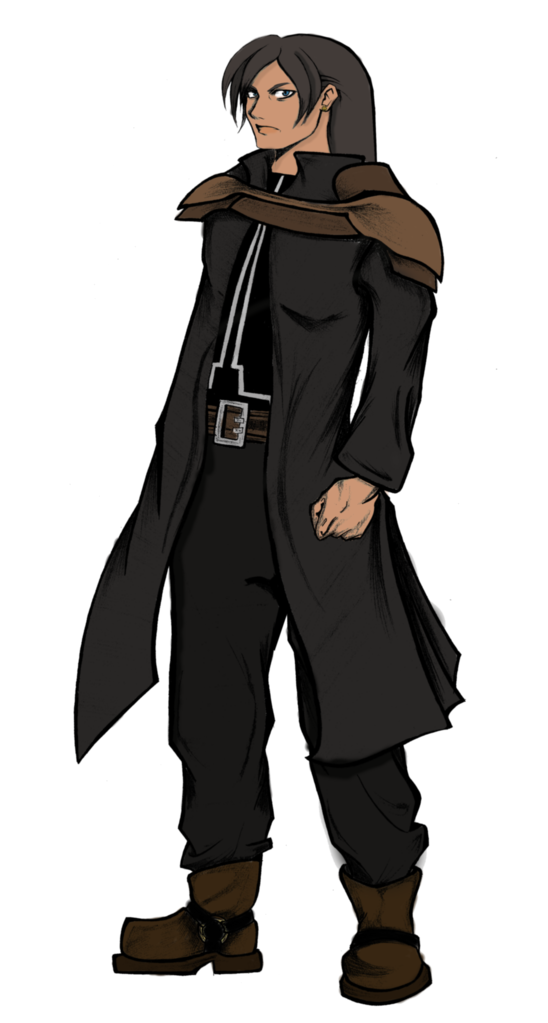
looks to me like you just added some highlights and made his cheeks rosy and if your light is coming from behind him the backs of his legs wouldnt have such a dark outline like that same with his back, id say the best improved spot would be his left side of the lower portion on his jacket and the back of his right foot

oh and please fix the out of the lines coloring above his left boot :p we arent 7 years old anymore are we?

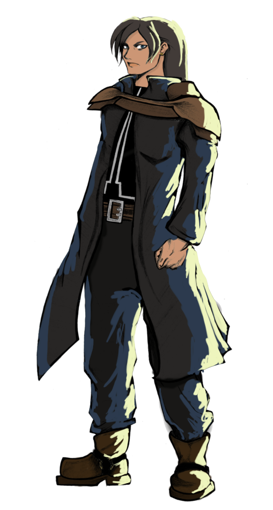
a good tip to see how the color, shading and highlights should be is to take a black tshirt of yours, im sure you own some black article of clothing, toss it over the back of a chair and look closely at the values in the cloth, where the shadows and highlights are, the general color of the darkest bits compaired to the lighter and how the color fades into itself, look at it from an angle of light similar to what youre aiming for in the drawing. why do i say color? because your "black" tshirt isnt black unless its a new moon and your lights are off, basically theres SOME, color there, not much but some, but thats a lesson for another day lol
 
Yeah, I used the burn tool to add a few highlights and shadows, the magnetic lasso to take the armour on his shoulders and raise the saturation a bit more and fiddle with the hue a little to give it more of a bronze feel because on the previous version it looked a little too "wooden" looking. I darkened much of the drawing to make it look a little more realistic and less painted and used the smudge tool to off-end any stray lines I could find. Good idea at the t-shirt though. I'll give that a try on the next drawing I colour. About the boot I'm not sure what you mean though, the highlight above his toes was a mistake yeah but I can't see what you're looking at here.
 
I would really recommend hand-selecting your colors instead of using dodge and burn. Picking color carefully has a huge effect on how good your piece looks, and you want to change the hue (as a general rule of thumb, highlights should be yellower and shadows bluer, but it depends on the light and the material, and you want to check references for exact colors) in addition to the lightness. Dodge/burn screams amateur anime artist, and tbh no shading at all looks amazingly better as far as I'm concerned.

Also, your coloring looks kind of beveled or something. Your shadows and highlights are right next to the edge, which makes him look very flat. Study some real people or photos thereof and see how the light falls to make them look three-dimensional. Backlighting is more difficult than something you should probably be trying at this point, so I would recommend sticking with an easy light source for now (say, upper left) and moving onto other things once you have that down.
 
Here are some backlighting references:
BnMnkBackLit.jpg

man-standing-looking_~PAA353000014.jpg

The light is pretty blue in the second pic, but you get the idea.

Okay, here is an awful-looking, half-assed example (I'm really bad at backlighting without a good reference and don't have a lot of time atm), but hopefully it's somewhat instructive.
KeirosArtAttempt.png


The blue looks weird because your gray is warm, but whatever, I'm too lazy to change it.
 

Thank you for viewing

HBGames is a leading amateur video game development forum and Discord server open to all ability levels. Feel free to have a nosey around!

Discord

Join our growing and active Discord server to discuss all aspects of game making in a relaxed environment. Join Us

Content

  • Our Games
  • Games in Development
  • Emoji by Twemoji.
    Top