
You are using an out of date browser. It may not display this or other websites correctly.
You should upgrade or use an alternative browser.
You should upgrade or use an alternative browser.
Claíomh Enrise concept - Updated
- Thread starter Zackwell
- Start date
MCsephiroth13
Member
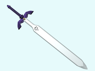
You made way too much use of gradients. Steel tends to have sharper lines that define the edges in the shading. Take a look at the Master Sword and you'll see what I mean:

See how the sword still has a gradient at the bottom, but the darker edges give it the feel that it's shaded? Yeah, other than that, your sword looks amazing! Especially the markings on the blade. VERY nice.

See how the sword still has a gradient at the bottom, but the darker edges give it the feel that it's shaded? Yeah, other than that, your sword looks amazing! Especially the markings on the blade. VERY nice.
i personally think that gradiented vector art looks awful without thin linework around it. it looks incomplete. try to do an iteration with thin outlines. and you dont necessarily have to do black; maybe do a shade darker than the fill color. it should look a lot sharper that way, and less "hey i can use the gradient paintbucket yeah!!!"
also: there's nothing wrong with using more interesting colors!!! metals typically aren't white>grey. You see shades of blue, brown, purple, etc etc etc. Gold isn't yellowish, it has ruddy shadows and purplish highlights. getting wild with color is almost never a bad thing.
also: there's nothing wrong with using more interesting colors!!! metals typically aren't white>grey. You see shades of blue, brown, purple, etc etc etc. Gold isn't yellowish, it has ruddy shadows and purplish highlights. getting wild with color is almost never a bad thing.
Perihelion
Sponsor
I basically came in here to say what Ven said. Tbh I almost never like gradients for shading even in vector art (gradients are tacky imo unless used VERY sparingly--either shade for real or use solid colors), but yeah, lines would make it look better. You're probably not going to make it actually look like metal if you're shading with gradients, but picking more exciting colors would help. In general, you want to color based on observation, not on assumption. Like you're assuming here that steel is gray and gold is yellow. That isn't really true. Just like grass isn't always green and water isn't always blue and bark isn't always brown.
Here are some pictures. Really look at them. See what the light does and how the color changes.


Steel is very shiny and tends to take on the colors of its surroundings. Also, metal it tends to have really high contrast, not soft transitions between colors. Blue is always a good choice, but you can do other things too--look at how the color varies through those pictures.


Ven: Purplish highlights for gold? Really? o_O I never noticed. I'm godawful at metal, though.
Here are some pictures. Really look at them. See what the light does and how the color changes.


Steel is very shiny and tends to take on the colors of its surroundings. Also, metal it tends to have really high contrast, not soft transitions between colors. Blue is always a good choice, but you can do other things too--look at how the color varies through those pictures.


Ven: Purplish highlights for gold? Really? o_O I never noticed. I'm godawful at metal, though.
Perihelion
Sponsor
Also, I suspect you don't care and the rest of this paragraph is completely beside the point, but uh, your sword design doesn't look very practical. The wings are going to get in the way of someone grabbing it (are they part of the sword? o_O), and the crossguard is odd. Generally you want it to curve up to catch the other guy's sword and prevent him from slicing your hand off, not down such that his blade slides off the crossguard and into you. It looks like you were almost thinking of a basket hilt but then made it a crossguard instead... @_@ I see what you did there with the pointy things sticking up, but still, it looks odd, and there's all that junk there taking up room on the sword that could be used for cutting people. The thin spoke things separating the blade from the hilt look like they'd bend or break the second anything hit the flat of the blade, but it's presumably magical, so...
Then again, I hate speshul magical swords with a passion and am anal-retentive about things not looking COOL(tm) at the expense of being functional, so uh, I'll end that train of thought there. It's certainly no worse than anything you see in an average Final Fantasy game, but it always irritates me, so don't mind me and my carrying on about my pet peeves too much. :p
Then again, I hate speshul magical swords with a passion and am anal-retentive about things not looking COOL(tm) at the expense of being functional, so uh, I'll end that train of thought there. It's certainly no worse than anything you see in an average Final Fantasy game, but it always irritates me, so don't mind me and my carrying on about my pet peeves too much. :p
I agree 100% with peri. That looks more like a decorative art piece than a functioning weapon. Remember, a sword's number one purpose is to hurt and kill your opponent. You can still make it look "cool" but functional. I wonder if I can find that pic I drew a few years back of a sword with a dragon hilt.
PuppetOfFate
Member
I prefer version 2 because it seems a bit more crisp but the shading still seems a bit off.
Perihelion
Sponsor
I'm going to have to respectfully disagree with the advice to use filters for texturing, as imo they're really tacky. What you have here is vector art. Treat it accordingly--solid colors and maybe, maybe like one gradient somewhere.archerRin":1tdlks8z said:Texture it more, either filter or with photos. Use noise> add noise (mono) into it for example. Looks too much like a toy as it is now. The design is awesome though, mad props!
In general, unless you really know what the fuck you're doing, avoid filters like the plague. All they're gonna do is make your stuff look junky and amateurish.
Alexander Morou
Sponsor
Personally metal for the most part won't show 'noise' like the filter effects give. Such imperfections would be only be noticeable through a fine look over the piece, unless it's been subject to actual use wear. Even then the noise filter isn't what you'd see it as. I think the noise you're referring to is particles in high detail pieces other than the the object itself. Atmospheric effects such as dust particles or other elements of the atmosphere that make things 'fuzzy' in some respects.
A lot of the variety in the look to a metallic piece comes from atmospheric lighting. On top of the colors it absorbs, a large majority of it is reflected back, almost perfectly, causing a mirror like finish (if the image is distorted this is due to the surface being concave, convex, or imperfect in some other way). Remove the background and other elements, and you get a very simple looking object, assuming you could ever truly remove all objects from reflecting off of the surface.
I hope Venetia will correct me if I'm wrong, but I believe a large majority of the colors in the shadow comes from atmospheric lighting, you sit a red ball on a white table with a white backdrop behind the ball, and have this outside, there's a blue tint to the shadow of the ball because the table itself is picking up the atmospheric light as well, which is majorly blue, and reflecting this onto the shadowed side of the ball. Add to this the fact that the atmospheric light is hitting the actual cast shadow, if there was just the (blue) light from the atmosphere and no sun, the ball (or you and I) wouldn't cast a shadow (except for the areas where the light can't reach) because the light around the ball would be uniform.
you guys are making me doubt myself lol. I know what you mean but im not saying add noise out of my ass.
Here is one example of what you can do with noise, you filter clouds, add noise then motion blur to make this texture over the sword. i didnt erase the texture on non metallic parts cause its only an example.

Here is one example of what you can do with noise, you filter clouds, add noise then motion blur to make this texture over the sword. i didnt erase the texture on non metallic parts cause its only an example.

Alexander Morou
Sponsor
You really only accomplished breaking the gradients up so they're less obvious, but they're still there. Much of this 'noise' you've added is too directional to be of use for a metallic look, metal doesn't scatter light like that, unless it's pot metal or it's an abrasive surface due to the way it's made.
Here is an example of a good texture on a blade. It's surface is broken up and it's not a polished finish, but you also notice it doesn't look like static noise, it looks old.
Here is an example of a good texture on a blade. It's surface is broken up and it's not a polished finish, but you also notice it doesn't look like static noise, it looks old.
if you have a vector and it is very obviously not rendered to be photorealistic then it is actually incredibly counterproductive to add photorealistic filters to them unless you're trying to achieve an effect of the vector being printed onto some sort of textured photorealistic medium.
basically: don't mix photoreal effects with vector effects unless you're trying to convey the vector as an artificial thing on a realistic thing. It's about style; the style the OP is going for is very obviously not one of realism, so along the lines of using a heavily-stylized vector, filters aren't necessary and are probably superfluous.
In this case all the guy needs to do is cut down on the gradients and add outlines. That's really all.
Thank you for viewing
HBGames is a leading amateur video game development forum and Discord server open to all ability levels. Feel free to have a nosey around!
Discord
Join our growing and active Discord server to discuss all aspects of game making in a relaxed environment.
Join Us

