
Britchik's Workshop
Welcome to my workshop. Most of what you'll find here is HKCP resources that I'm working on. Finished pieces will be available through the HKCP gallery.
Updates
1-4-08: More naga frames added.
25-3-08: Updated the naga with some more frames and edits.
24-3-08: New stuff added!
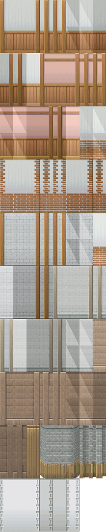
20-3-08: A minor update to the walls. I've recoloured the highlighted walls, and have added a new wall at the bottom. The stone and wood wall is still in progress; I'm trying to figure out the best way to shade the wood.
11-3-08: Well, in preparation for the eHKCP, I'm working on tileset stuff again, mainly RTP stuff that has been edited / redrawn to fit with HK. I'm working on interior walls first, then I'll move on to wall add-ons (windows, interior doors, etc.).
Also, I'm still struggling with the child's winter cloak, and any help at all would be great, please!
Without further blabbering, here goes.
HKCP
Inspired by seeing RTP snow towns with villagers wearing summer clothing. I'm hoping to do some winter clothes for child, adult female, and adult male, and will possibly do some for the other templates if I have time / if people actually want them.
Edit: Newest version here. I'm still really unsure of the back moving frames (as you can probably tell, since they're unfinished). Any advice or reference pics would be appreciated.
Done! Here's the pieces separated:
These pieces have been uploaded to the HKCP gallery, plus recolours.
eHKCP
Nothing too horribly exciting, and still a work in progress, but comments are appreciated. *Updated 20-3-08
aHKCP

This is probably the hardest thing I've ever tried to make, so please let me know if something's wrong with it so I can fix it! I used Snake03 from the RTP as a guide for the shape, but repixelled the shading myself.
(25-3-08)
Edit to lessen the highlights and add some more scales:

Also, I've started working on some of the other frames. The animation is... well, not great, so advice would be appreciated. The alignment isn't quite right, because I plan to do that after I've finished all the frames.

(1-4-08)
Most recent update. The animation still needs a little work, but overall I'm happy with the motion, so after a little tinkering and lots of shading the side views will be done! The front views also need to be shaded still, obviously. The back views.... well, let's not go there just yet. (Translation: yikes.)

Credit to Showkaizer for the HK template.
Welcome to my workshop. Most of what you'll find here is HKCP resources that I'm working on. Finished pieces will be available through the HKCP gallery.
Updates
1-4-08: More naga frames added.
25-3-08: Updated the naga with some more frames and edits.
24-3-08: New stuff added!
20-3-08: A minor update to the walls. I've recoloured the highlighted walls, and have added a new wall at the bottom. The stone and wood wall is still in progress; I'm trying to figure out the best way to shade the wood.
11-3-08: Well, in preparation for the eHKCP, I'm working on tileset stuff again, mainly RTP stuff that has been edited / redrawn to fit with HK. I'm working on interior walls first, then I'll move on to wall add-ons (windows, interior doors, etc.).
Also, I'm still struggling with the child's winter cloak, and any help at all would be great, please!
Without further blabbering, here goes.
HKCP
Inspired by seeing RTP snow towns with villagers wearing summer clothing. I'm hoping to do some winter clothes for child, adult female, and adult male, and will possibly do some for the other templates if I have time / if people actually want them.
Edit: Newest version here. I'm still really unsure of the back moving frames (as you can probably tell, since they're unfinished). Any advice or reference pics would be appreciated.
Done! Here's the pieces separated:
These pieces have been uploaded to the HKCP gallery, plus recolours.
eHKCP
Nothing too horribly exciting, and still a work in progress, but comments are appreciated. *Updated 20-3-08
aHKCP
This is probably the hardest thing I've ever tried to make, so please let me know if something's wrong with it so I can fix it! I used Snake03 from the RTP as a guide for the shape, but repixelled the shading myself.
(25-3-08)
Edit to lessen the highlights and add some more scales:
Also, I've started working on some of the other frames. The animation is... well, not great, so advice would be appreciated. The alignment isn't quite right, because I plan to do that after I've finished all the frames.
(1-4-08)
Most recent update. The animation still needs a little work, but overall I'm happy with the motion, so after a little tinkering and lots of shading the side views will be done! The front views also need to be shaded still, obviously. The back views.... well, let's not go there just yet. (Translation: yikes.)
Credit to Showkaizer for the HK template.
")