Envision, Create, Share

Welcome to HBGames, a leading amateur game development forum and Discord server. All are welcome, and amongst our ranks you will find experts in their field from all aspects of video game design and development.

American Hero's Resourses

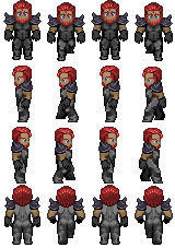
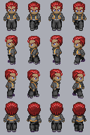
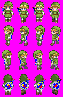
Here is some I made.

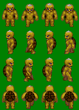
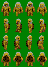
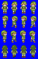
Tell me what you think.
Don't make me mad or Ill kill you.  :lol:


Ganondorf2-1.png


WindmillMan.png


SonofGanon.png


Goron1.png


Darmani.png


MaskSellsman.png


MasterSwordLink.png


AdvancedAdultLinkGreen.png


AdvancedAdultLinkRed.png
 
Only problem I can see is the shell on the Gorons.  First the borders are to dark, don't use black.  Also they didn't have turtle shells like you have on them, they were rocks and you could see their back in between them.  Other then that looks great!  Although the red link is way to bright.
 
OK, here's what I noticed. Please note this is just constructive criticism.

1: Hair casts a shadow. This seems to be a bit of a problem, especially on those turtle guys.
2: Hair should never look gradienty. Turtle guys again, I'm afraid. Try looking at Venetia's incredible HK hair tutorial in the Tutorials board, and applying some of those ideas over to the RTP sprite.
3: Saturation. The saturation on Link's shield and sword is quite painful. Now, maybe that's just my eyes, but I'd still reduce it a little.
4: Incomplete shading. I was looking at the Link sprites, and my thoughts on the hat were as follows. 'Hmm... nice.' 'Not bad... light source is a little strange, but well shaded', 'Same thing flipped' and finally 'WTF is that supposed to be?'
Not being angry or anything... but the first three rows are quite well done. The last row is kind of a letdown, especially on the red Link.

But first and foremost, remember about shadows, as that's the main thing I see lacking with your work.
 
i like the newer version of the goron, sorta remiinds me if Loz Ocorina of time
then again ive always liked zelda games
 
Newer looks better... While looking through the first time (I never did comment...) I thought you had made a Kappa
 
tgman":f520p3fp said:
i like the newer version of the goron, sorta remiinds me if Loz Ocorina of time
then again ive always liked zelda games
I actually used pics from that game as references when making the sprite.
 
Here i did a super ultra quick edit.

Choose a direction for the light to be coming from.
And choose colors with more contrast.
check out the tutorials that boon posted
on color selection.

You can use color palettes that don't shift hue but it helps in sprites.
Here is a crazy picture Frost from pixeljoint made and he used almost
no hue change at all in the entire picture.

here is the pic::

http://www.pixeljoint.com/pixelart/38741.htm

This is the palette he used::


So as you can see you don't have to hue shift but it helps most of the time.
 
@fucbillgates, thanks for the tips, but what you did to my goron is horrific. He looks way to "sharp" and why is he so shiny? But I believe that the sprite would look perfect if I could find a "happy medium" between the 2 versions. I recognize that you are being very helpful. Thanks.

bojjenclon":mlxje6n3 said:
Some of the best LoZ stuff I've ever seen made for XP, nice job man.
Thanks for the comment, I was pretty much forced into making these because of the lack of RTP style LoZ sprites for XP.
 
He looks way to "sharp" and why is he so shiny
Ahhh that's blinding!!!
now that i had a chance to take a look at this on my lcd monitor at home the colors
have too much contrast.

well the main thing i was trying to point out is to use a higher contrast color pallet and don't mirror the shading so it's the exact same on each side.
 
don't mirror the shading so it's the exact same on each side.
Well, the thing with directional lighting is that if you have lights on the left side of the map only, then it'll look odd because there is no light source from the right side that the sprite seems to show.
Also, in your edit, it looks like the left leg (I mean our left, not the sprites left) is behind while the right leg is in the foreground. Making something brighter makes it pop out more, and making it darker makes it recede into the background, as does working with warm and cool colors.

I wouldn't exactly mirror it, but I think a direct top down (or something to that extent, looking at SNES graphics could help with that) lighting instead of a right or left directional would be better, unless you don't really care when situations like the above happen. Also, if you're going to do that, you have to be consistant and light the rest of the resources in a similar manner.

Here's my edit, I'm sleepy so I may iron out any mistakes later... but I'll probably be too lazy for that.
 

Thank you for viewing

HBGames is a leading amateur video game development forum and Discord server open to all ability levels. Feel free to have a nosey around!

Discord

Join our growing and active Discord server to discuss all aspects of game making in a relaxed environment. Join Us

Content

  • Our Games
  • Games in Development
  • Emoji by Twemoji.
    Top