Envision, Create, Share

Welcome to HBGames, a leading amateur game development forum and Discord server. All are welcome, and amongst our ranks you will find experts in their field from all aspects of video game design and development.

Acristic Logo

zchin

Sponsor

So i've just been creeping around the place looking at art and game developments... it's been interesting...

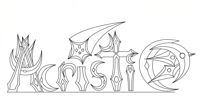
But I've been active game wise in the Acristic Team and we've almost completed our first game (no matter how simple) and I just thought that with the spare time I'll have I better start working on something to keep me occupied. So in math class I drew this, and just recently i've finished the line art using Inkscape.
scan0015.png


Any comments on it would be nice, possible colors and style suggestions would also be very appreciated. If you find any inconsistencies i'll tweak them out because I still have the editable file for this.

Tyahand
 
I'm sure this logo reflects the magical nature of your game, but I think it is too busy. Granted this is just one man's opinions, but here is how I would alter the logo:

I would take out the background elements behind the "A" and the "C" on the ends of the logo, and shrink the end "C" to the same size as the lowercase "c".

Shrink the shooting star dot of the first "i" and remove the trail behind it. I would make it the same size as the moon dot of the second "i". Probably remove the diamond, star, circle, and square elements of the shooting star as well.

Other than that, I think a dark color scheme would suit this logo. Maybe a dark burgundy with altering values / intensities? Stick with a monochromatic scheme, it should help with some of the business.

/2¢
 
...He forgot to mention that his art is for a flashy look to our team. Our logo is actually something pretty simple.

359mpaa.jpg


I just thought you should know so that you don't critique him about how busy his "logo" is.
 

zchin

Sponsor

Ahh, sorry about the late work... I have originally planned to do a while ago, but I forgot that I'm usually busy over the weekend...

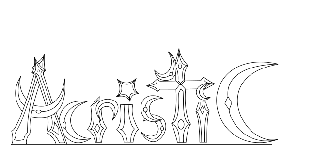
I tried the suggestions, and I got puzzled on why Inkscape was acting the way it was... Like not saving the layers... Still haven't figured it out but it still works, and hopefully I can color it in without any problems... Hopefully.


Any ideas on if it looks like an improvement or not? Because I'm still open to suggestions before I attempt for color.

Tyahand
 
RadethDart":2j2czqmi said:
...He forgot to mention that his art is for a flashy look to our team. Our logo is actually something pretty simple.

359mpaa.jpg


I just thought you should know so that you don't critique him about how busy his "logo" is.
That's fine ... But a logo's point is in being easy to read! If a logo is too busy to read, then it's not a logo, it's ... Just a thing that's hard to read.

Anyway,

In the original one, I couldn't make out the "C" at all, and there really was too much going on. In the latest one there is a lot less craziness going on, so it looks quite a bit better.
(But what's with the little moon shape sitting on top of the 't'? it looks random and unnecessary)

Nothing about it really stands out as looking terribly alluring or professional looking, though. Perhaps it would look better with colors & blending, but as linework, it just looks like you got excited with the curve tool.

Not trying to break your bubble or anything. I've made a million logos that have had pretty much the same critique. It's hard making something that is both fancy and eye-catching in a memorable way.
 
Venetia":2ub0t4j1 said:
RadethDart":2ub0t4j1 said:
...He forgot to mention that his art is for a flashy look to our team. Our logo is actually something pretty simple.

359mpaa.jpg


I just thought you should know so that you don't critique him about how busy his "logo" is.
That's fine ... But a logo's point is in being easy to read! If a logo is too busy to read, then it's not a logo, it's ... Just a thing that's hard to read.

Lol, what I meant to say is that he isn't making the logo. What he did was something more on the graphic design side - but I appreciate the changes made to make it more readable. :)
 

zchin

Sponsor

Honestly Venetia I really got excited about the pen tool in inkscape lol. But it isn't really a logo more of design as radeth said.

Tyahand
 

Thank you for viewing

HBGames is a leading amateur video game development forum and Discord server open to all ability levels. Feel free to have a nosey around!

Discord

Join our growing and active Discord server to discuss all aspects of game making in a relaxed environment. Join Us

Content

  • Our Games
  • Games in Development
  • Emoji by Twemoji.
    Top